When it comes to designing or redesigning a website, it’s easy to get hung up on the aesthetics. Does that shade of blue look right? Should the logo be on the right side of the screen, or left? What if we put a giant animated GIF in the middle of the page?
However, in a world where folks have more than 1.8 billion websites they can potentially land on, you need to make sure yours is not just a pretty face. It should be designed for usability, how easy your website is to use, and user experience (UX), how enjoyable it is to interact with your website.
Now, you could spend years studying the ins and outs of these disciplines But for the sake of giving you a jumping-off point, we’ve assembled a list of the fundamental guidelines and best practices you can apply to your next website redesign or website launch. Then, we’ll review 10 features you’ll need on your site to put these recommendations into practice. Let’s dive in.
1. Simplicity
While the appearance of your website is certainly important, most people aren’t coming to your site to evaluate how slick the design is. They want to complete some action, or to find some specific piece of information.
Therefore, unnecessary design elements (i.e., those which serve no functional purpose) will only overwhelm and make it more difficult for visitors to accomplish what they’re trying to accomplish.
From a usability and UX perspective, simplicity is your best friend. If you have all the necessary page elements, it’s hard to get too simple. You can employ this principle in a variety of different forms, such as:
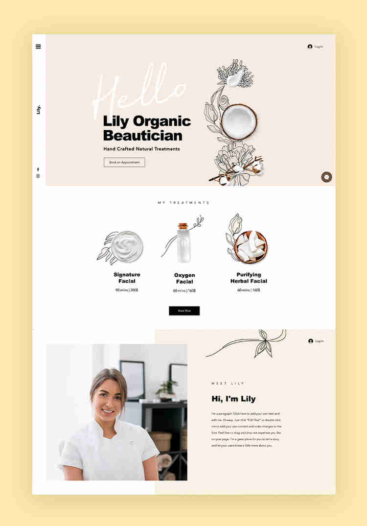
- Colors: Basically, don’t use a lot. The Handbook of Computer-Human Interaction recommends using a maximum of five (plus or minus two) different colors in your design.
- Typefaces: The typefaces you choose should be highly legible, so nothing too artsy and very minimal script fonts, if any. For text color, again, keep it minimal and always make sure it contrasts with the background color. A common recommendation is to use a maximum of three different typefaces in a maximum of three different sizes.
- Graphics: Only use graphics if they help a user complete a task or perform a specific function (don’t just add graphics willy-nilly).
2. Visual Hierarchy
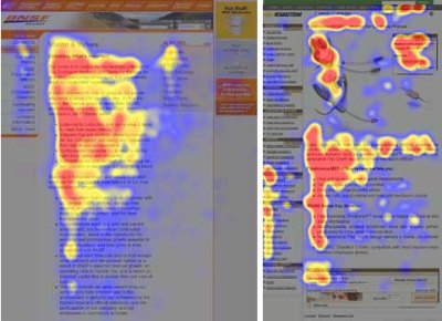
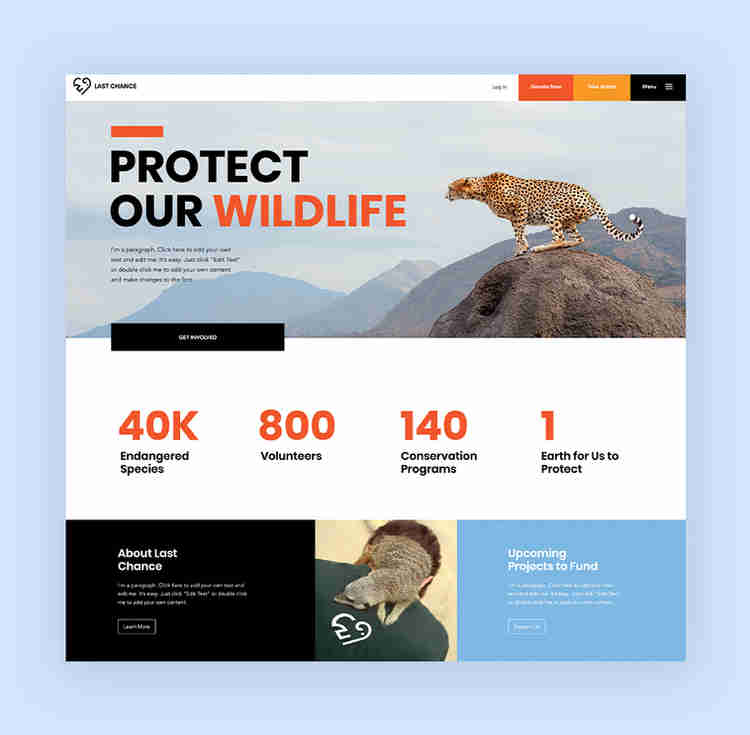
Closely tied to the principle of simplicity, visual hierarchy means arranging and organizing website elements so that visitors naturally gravitate toward the most important elements first.
Remember, when it comes to optimizing for usability and UX, the goal is to lead visitors to complete a desired action, but in a way that feels natural and enjoyable. By adjusting the position, color, or size of certain elements, you can structure your site in such a way that viewers will be drawn to those elements first.
In the example below from Spotify, you can see that the main heading “Get 3 months of Premium for free” sits atop the visual hierarchy with its size and page position. It draws your eye to their mission before anything else. This is followed by the “Get 3 Months Free” CTA, which prompts action. Users can click this CTA, or scan the menu items above for more actions.

3. Navigability
Planning out intuitive navigation on your site is crucial to help visitors find what they’re looking for. Ideally, a visitor should land on your site and not have to think extensively about where to click next. Moving from point A to point B should be as frictionless as possible.
Here are a few tips for optimizing your site’s navigation:
- Keep the structure of your primary navigation simple (and near the top of your page).
- Include navigation in the footer of your site.
- Consider using breadcrumbs on every page (except your homepage) so users remember their navigation trail.
- Include a search bar near the top of your site so visitors can search by keywords.
- Don’t offer too many navigation options per page. Again, simplicity!
- Include links within your page copy, and make it clear where those links go.
- Don’t make users dig too deep. Try making a basic wireframe map of all your site pages arranged like a pyramid: Your homepage is at the top, and each linked page from the previous forms the next layer. In most cases, it’s best to keep your map no more than three levels deep. Take HubSpot’s site map, for example.
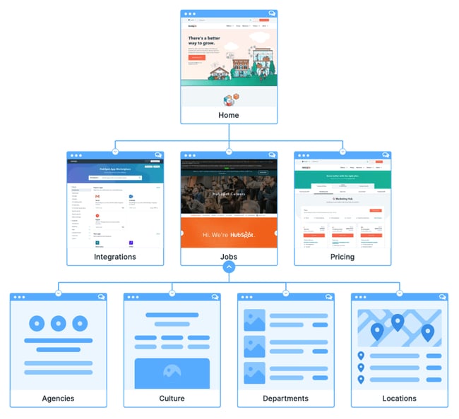
One more pointer: Once you’ve settled on what your site’s main (top) navigation will be, keep it consistent. The labels and location of your navigation should remain the same on every page.
This leads us nicely into our next principle…
4. Consistency
In addition to keeping your navigation consistent, the overall look and feel of your site should be similar across all of your site’s pages. Backgrounds, color schemes, typefaces, and even the tone of your writing are all areas where consistency has a positive impact on usability and UX.
That’s not to say every page should follow the same layout. Instead, create different layouts for specific types of pages (e.g., landing pages, informational pages, etc.). By using those layouts consistently, you’ll make it easier for visitors to understand what type of information they’re likely to find on a given page.
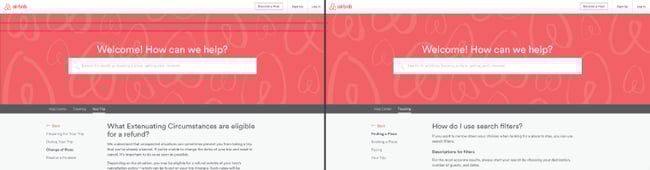
In the example below, you can see that Airbnb uses the same layout for all of its “Help” pages, a common practice. Imagine what it would be like from a visitor’s perspective if every “Help” page had its own, unique layout. There would probably be a lot of shoulder shrugging.
5. Responsivity
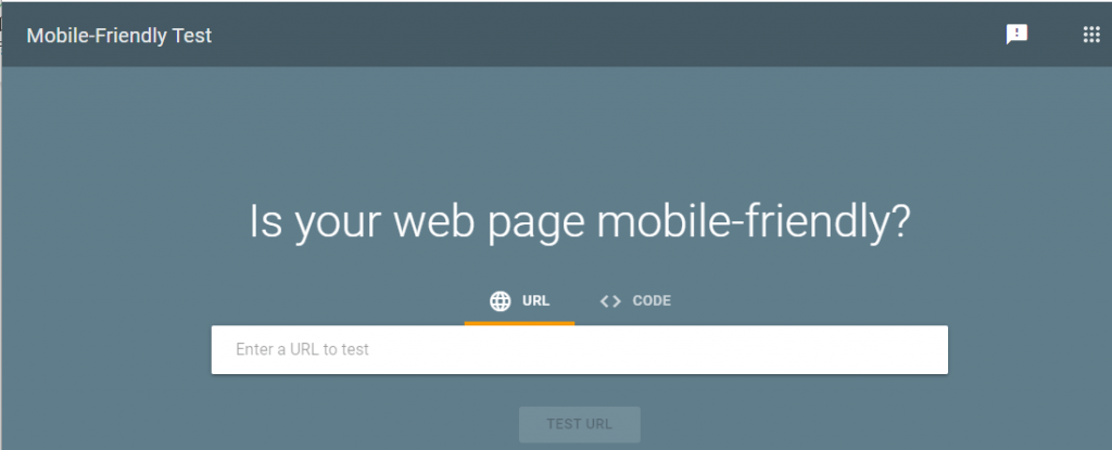
According to Statista, 48% of page global views were from mobile devices like smartphones and tablets. And according to our research, 93% of people have left a website because it didn’t display properly on their device.
The takeaway here: To provide a truly great user experience, your site has to be compatible with the many different devices that your visitors are